HACKATHON · HOCHSCHULE RUHRWEST
Designing crisis support for people usually left behind
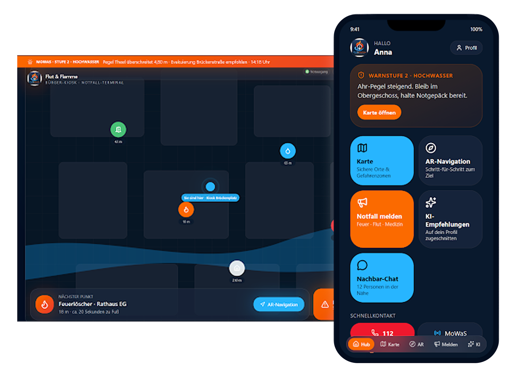
In a 2-day hackathon for my Human-Technology Interaction program, our team of 6 designed Flut & Flamme: a crisis-support app and public kiosk system built around the people most existing tools overlook: older adults, people with disabilities, and anyone without a smartphone.
ROLE
Research, Design, and Presentation
TIMELINE
2 day hackathon
TEAM
6, cross-disciplinary
TOOLS
Figma, AI Prototyping Tool
01
The context
This was a 2-day hackathon project for our Positive Computing & Diversity module, built with a team of 6. The brief: design a solution for crisis situations - floods, heat waves, storms - that reach people at very different starting points. Younger, well-connected people can usually find information and act fast; older people, people with disabilities, and families with kids or pets often can't. Existing tools solve only pieces of this: Germany's official NINA warning app sends alerts but has no navigation; Google Flood Hub visualizes flood risk but gives no concrete next steps or way to communicate with anyone. Nobody was combining warning, guidance, and neighbor-to-neighbor support in one place - especially not in a way that stayed usable when someone was frightened, disoriented, or without a working phone. Our team designed Flut & Flamme to close that gap: an app (and a public kiosk version for people without a phone) that shows real-time crisis information, guides people to safety with AR navigation, and connects neighbors who can help each other directly.
02
How we got there
With no time for original research, I used AI to quickly synthesize published findings on stress, decision-making, and disaster-app usability, and then double check the findings - turning hours of literature review into a working problem framing the team could design against from day one.
I worked on the onboarding and profile-setup flow - where users indicate whether they need help or can offer it, and flag specific needs like mobility limitations, pets, or children - along with the crisis map interface showing real-time hazard zones, safe spots, and supply stations.
To streamline the prototype I used the AI prototyping tool, Lovable. Rather than open-ended prompts, I gave Lovable a fully specified brief - exact hex values for our color system, concrete accessibility requirements, and a screen-by-screen spec of what each view needed to do. That precision meant the AI-generated prototype was usable from the first pass, not something we had to rebuild, so AI moved us faster because we already knew exactly what we wanted.
I helped write and structure the final pitch - particularly the societal-impact and target-audience sections - and presented alongside the team, framing the concept for an audience evaluating both its design and its real-world feasibility.
03
Key decisions
Designing for the person with the least access, not the average user
Rather than optimizing for the majority who are mobile and well-connected, we designed first for people who are hardest to reach in a crisis - non-smartphone users, people with disabilities, non-native speakers. That's why the kiosk version exists at all: without it, the app would have quietly excluded exactly the people most likely to need it.
AR navigation over a standard map
We chose AR-guided navigation over a conventional map view, because research on pedestrian navigation shows AR overlays are easier to follow under stress and in unfamiliar or chaotic environments - exactly the conditions this app is designed for. The tradeoff was build complexity in a 2-day window, but it directly served the core constraint: people in crisis can't reliably read and interpret a 2D map while frightened or disoriented.
04
Outcome
In 2 days, our team of 6 delivered a working high-fidelity prototype across two form factors - a mobile app and a public kiosk version - backed by a research-grounded pitch. The accessibility-first framing landed well with our instructors, who specifically noted the kiosk concept as a strong answer to a gap most crisis-tech solutions ignore: people without a smartphone.
05
Reflection
Compressing a full design process into 2 days forced real prioritization: we couldn't validate anything with real users, so we leaned hard on existing research to ground our decisions instead of guessing. It also reframed how I think about "edge cases" - designing first for the person with the least access, rather than retrofitting accessibility onto a solution built for the average user, produced a stronger concept, not a compromised one. If I did this again with more time, I'd want to test the AR-navigation flow with actual users, since that was the piece we validated the least.
Circular Economy Start-Up: MeinDein
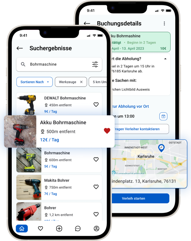
As Lead UX/UI Designer, I designed MeinDein from the ground up — one shared marketplace where private individuals and businesses could rent out everyday items to each other, rather than two separate platforms serving each side alone.